01 – Project Overview
Role
• Senior UX Designer
June 2021 – November 2022
Skip to the final product

Background
A former client was pursuing innovation in the farmland market, one of the largest U.S. real estate sectors, exceeding $3 trillion in value. Through this client’s internal underwriting process, we realized there was a large and underserved market for land analysis and appraisal. Our product vision was to see a world where every farm is bought and sold at a fair price.
Problem Statement
Buying and selling land is often an uncommon, opaque, and difficult task. Our user needed a way to more easily and transparently discover and evaluate land.
Goal
Empower our customers to buy and sell land smarter with advanced technology, data, and expertise.
02 – Research
User research
To begin our product discovery phase, I conducted both quantitative and qualitative research in collaboration with a product manager. The primary goal of our research was to gain insight into the user journey of anyone interested in buying and selling farmland, specifically focusing on the analysis and evaluation stage of the process. Through surveys and interviews, we were able to hone in on a handful of personas, gaining clearer insights on their specific pain points.
An initial survey, sent to farmers, brokers, and land analysts, included the following questions—
- First, what’s your occupation? What do you do all day?
- What does your land valuation process look like?
- When you are evaluating your own land, how important is it to you to have an accurate valuation range for your property?
In addition to user surveys, we also conducted interviews with farmers, brokers, and land analysts. These interviews included the following questions—
- Roughly how many hours a week would you say you spend using the internet, including web browsing and email, at work and at home?
- What kinds of sites do you look at when you browse the web?
- Do you have experience with mapping tools and, if yes, which have you used?
Result
We synthesized data into larger buckets–
- Speed
- Navigation
- Analysis
- Sharing
I used affinity mapping to organize key findings, which later became the feature requirements for our MVP. From here we were ready to move on to the definition stage.

03 – Definition
Personas
To inform our product decisions, we carefully considered a range of personas that represented our target users. These personas played a crucial role in shaping our deliverables, which included current state journey maps, future state journey maps, and identifying pain points for each user group.
Synthesis of user research lead to the creation of three primary personas—
- The Farm Analyst
- The Expanding Farmer
- The Farmland Broker

These personas where considered when making further product decisions and deliverables, including current state journey maps, future state journey maps, and defining pain points for each user group.
Current State User Journey | land Analyst
One of our exercises mapped the current state user journey of a land analyst. While we observed analysts conducting farmland underwriting sessions, we identified key patterns. These sessions involved the analyst frequently switching between multiple platforms. This juggling act was necessary to provide clients with timely information while interacting with them over the phone.
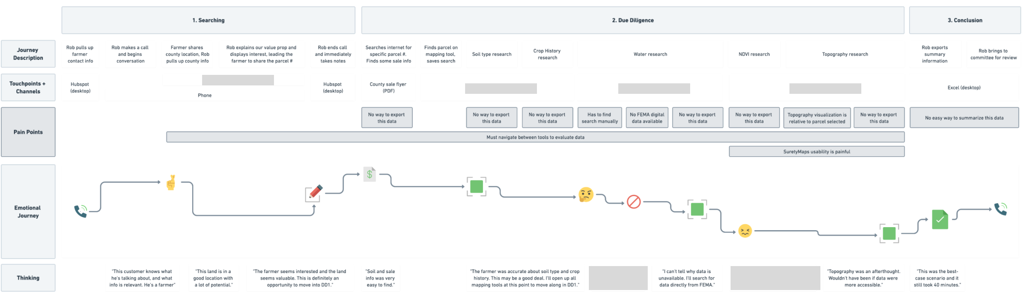
Pain Points & analysis
By mapping out current user journeys, we gained valuable insights into the pain points and inefficiencies faced by land analysts. This visual representation allowed us to identify areas where we could streamline their workflow, reduce context switching, and improve the overall user experience. It served as a foundation for designing a future state platform that addressed these pain points and provided a more seamless and efficient workflow for an analyst.
Common pain points that emerged included—
- Constant context switching to access relevant data
- No way to export or share insights
- Data summaries were difficult to access, especially when working between various layers
“My top priority is to find and source undervalued farms to purchase. I don’t have time to spare, so I need to be able to analyze potential farm leads accurately and quickly.”
—Land analyst
After compiling interview data and looking through user sessions, we discovered that our biggest problems to solve for included minimizing navigation between tools to evaluate data sets, providing a way to quickly export a data report or summary, and a lack of robust searching or selection interfaces, especially when switching between various layers. These findings mapped well with the affinity mapping buckets from our empathizing stage (speed, navigation, analysis, sharing).
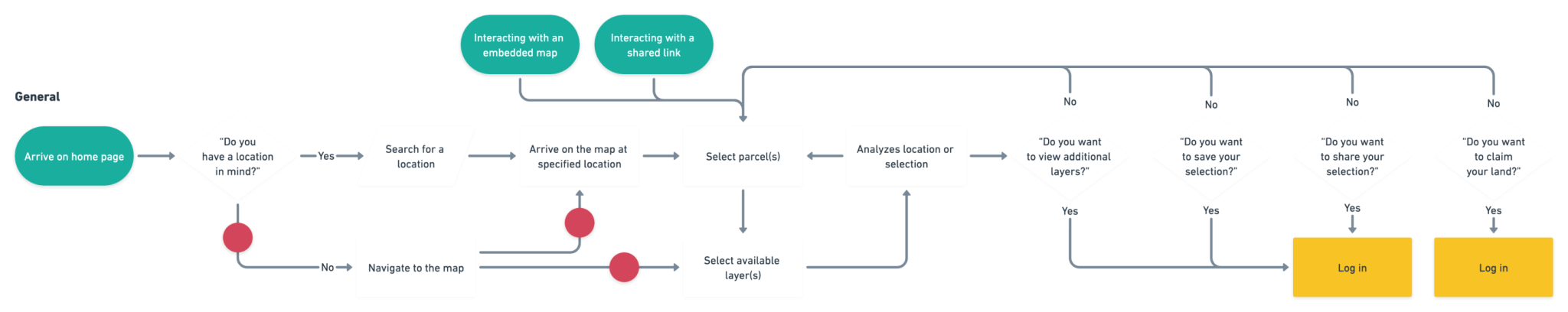
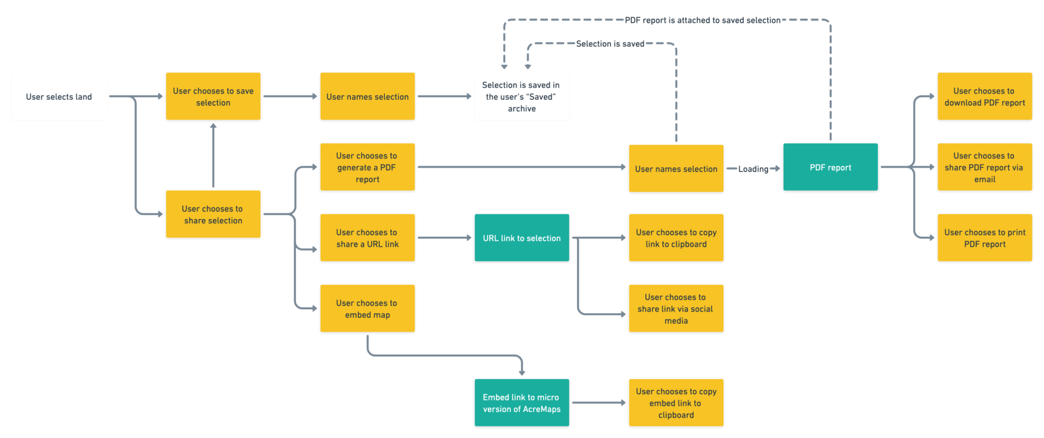
04 – Ideation
User Flows
We created a task analysis to understand essential screens needed for the application. The following user flows represent two major workflows we built our platform to solve for—
05 – Wireframing & Prototyping
Low-Fidelity Wireframes
We quickly built screens and got them in front of business stakeholders and representatives from our personas. These were designed in whimsical before moving on to mid- and high-fidelity wireframes in Figma.


Interaction Design

Elements for higher fidelity wireframes were primarily built in Adobe Illustrator and Adobe Photoshop, while screens and interactions were built in Figma.
06 – Testing
Usability Testing | Navigation
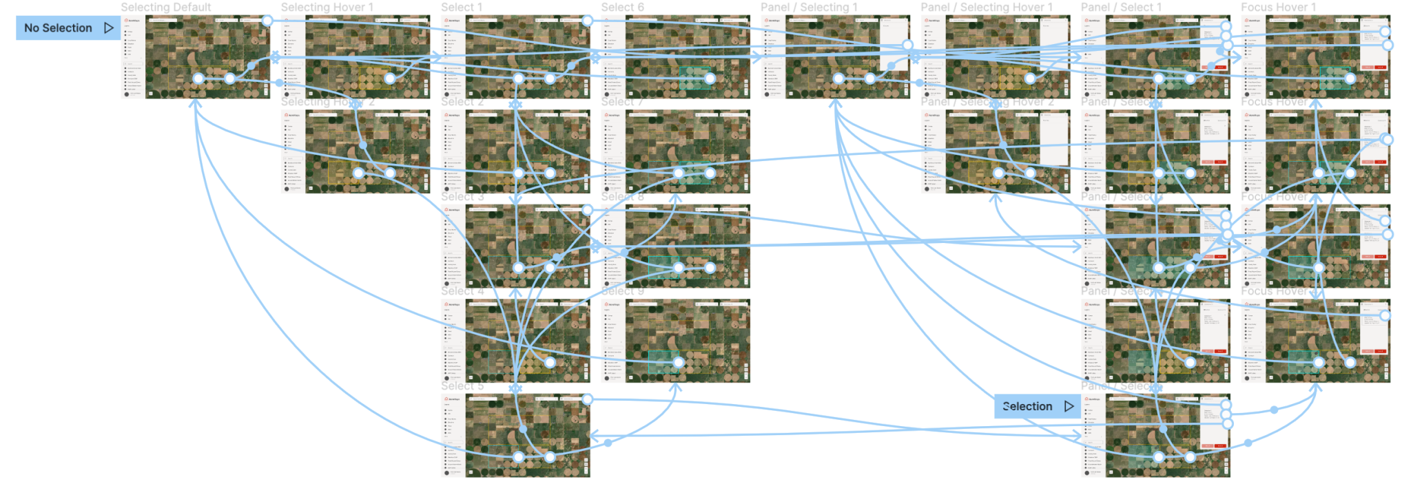
We conducted usability tests for our platform on a feature-by-feature basis.
In our pursuit of creating a user-friendly application, one of our initial significant tests focused on navigation. To ensure comprehensive feedback, we carefully selected a diverse group of participants representing our user groups. This sample included three farm analysts, three farmland brokers, and one expanding farmer. Each participant was assigned situational tasks that reflected real-world scenarios, and their behavior was closely observed during our sessions. We presented them with four high-fidelity prototypes, aiming to collect qualitative data through session recordings and detailed documentation.
Goal
The primary goal of this usability test was to assess the learnability of the application for new users on desktop. Our objective was to uncover any potential issues while observing participants as they completed basic navigational tasks. By evaluating how easily users could find their way through the application and identifying any stumbling points or challenges they encountered, we aimed to refine the navigation system and improve the overall user experience. The qualitative data collected during these sessions provided valuable insights and served as a basis for making informed design decisions moving forward.
Tasks

Results
During the navigational test, an intriguing and valuable insight emerged. Contrary to my initial hypothesis, users overwhelmingly expressed a strong preference for an option that granted them the most freedom to select parcels and layers simultaneously. This finding challenged my assumptions and shed light on a key aspect of the application’s usability.
The development of each feature followed a consistent framework. Each new feature started with user interviews, where we gathered valuable feedback and insights from our target users. This feedback was then analyzed to inform decision-making processes for both new feature development and the refinement of existing elements. By continuously incorporating user feedback into our design process, we sought to create a tool that truly catered to the needs and preferences of our users.
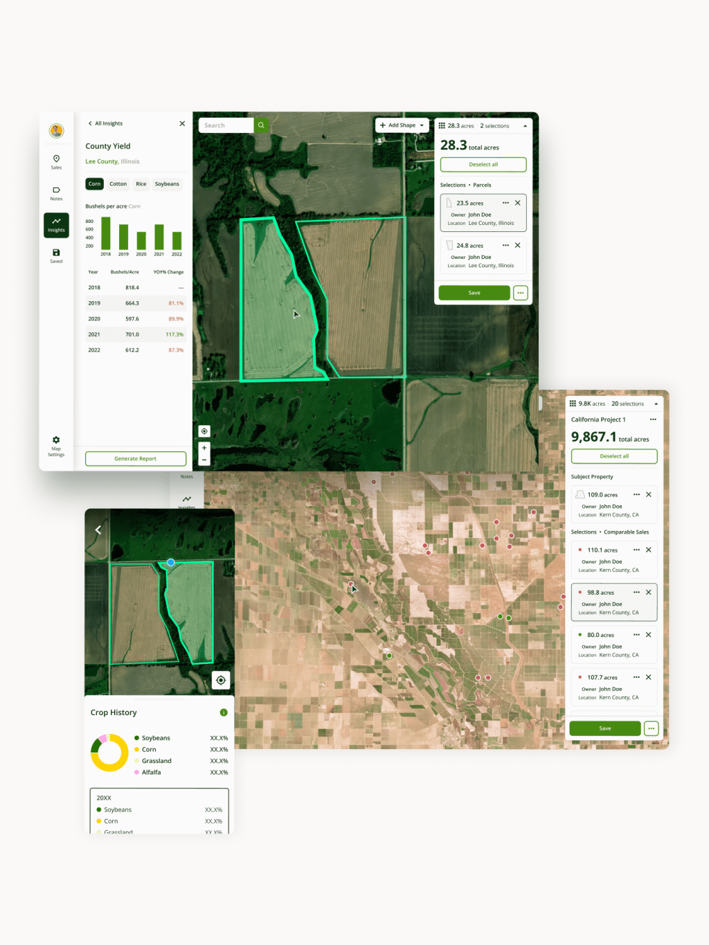
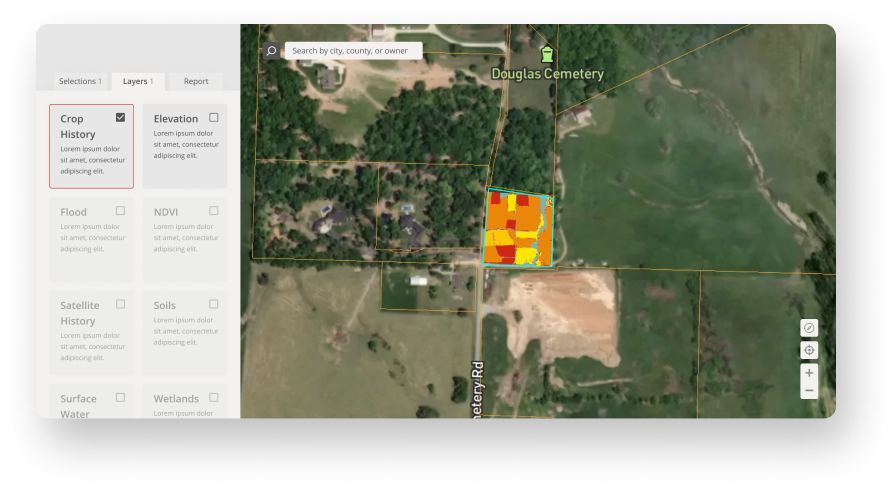
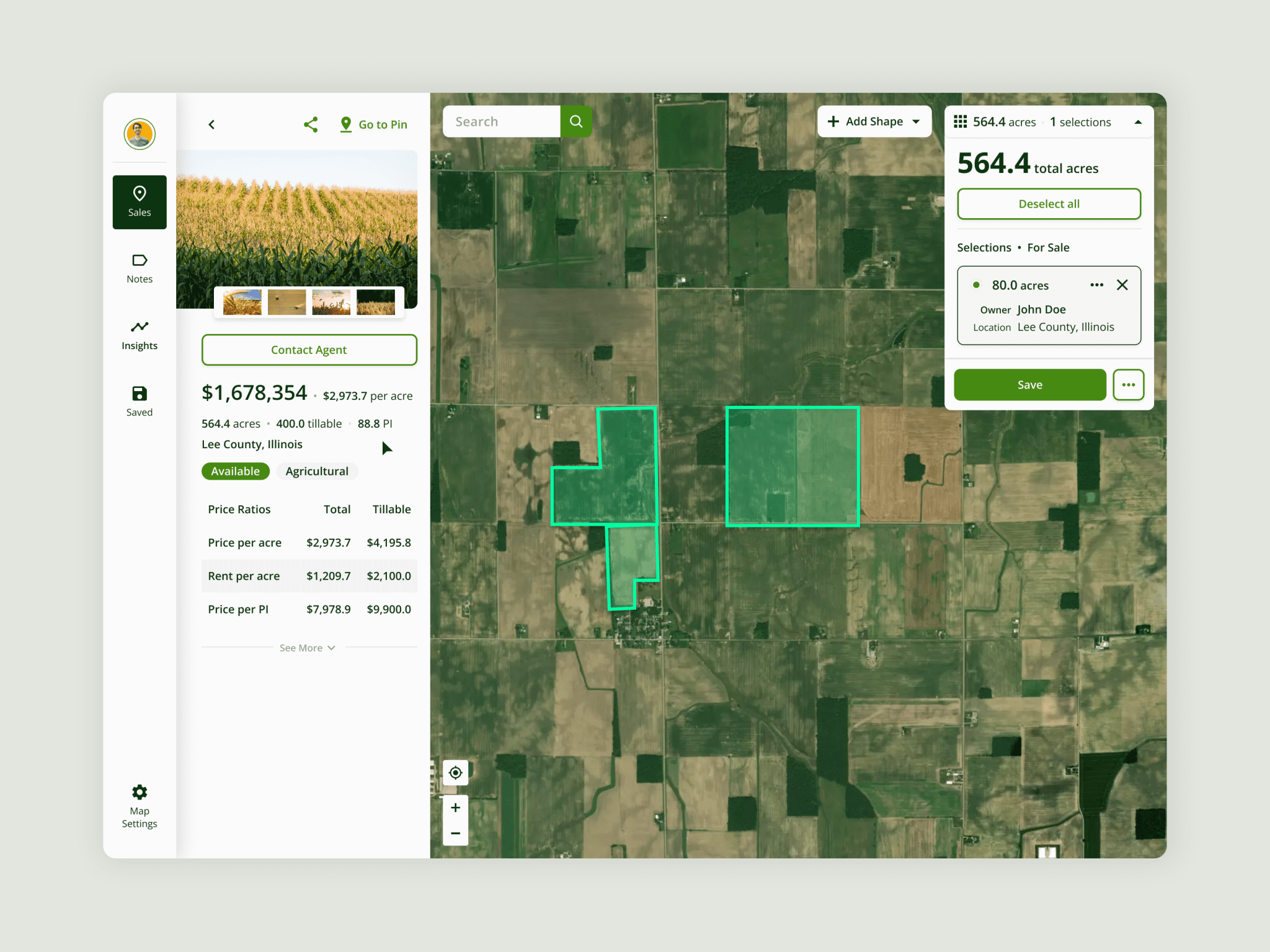
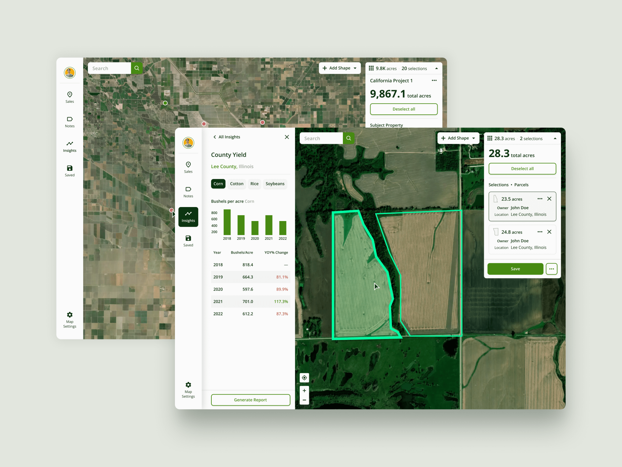
07 – Final Product
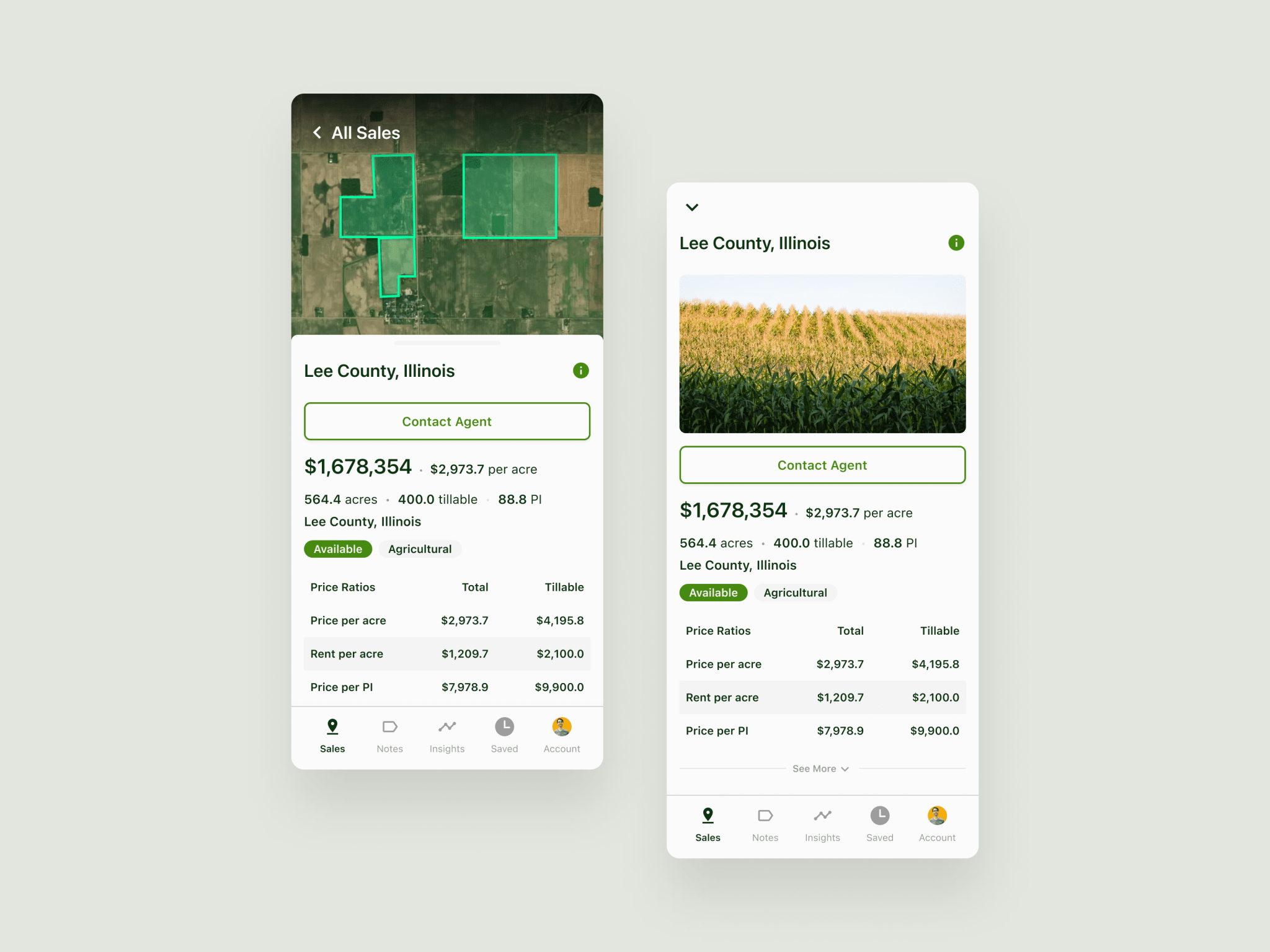
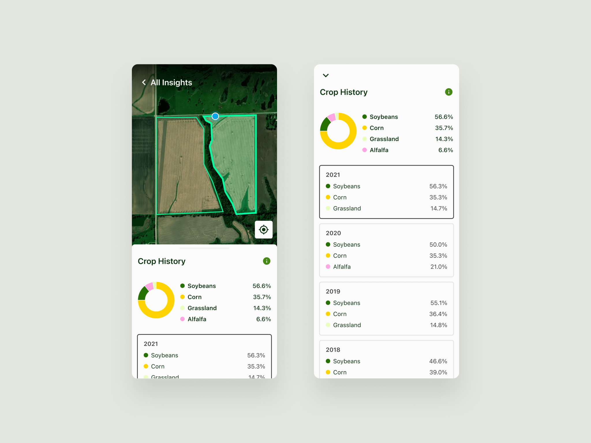
Desktop

Mobile

08 – Outcomes
One Year Later
Through continual user interviews, we confirmed our original hypothesis and helped to make buying and selling farmland more common and less opaque.
The following is a recording of one of our land analysts showcasing the ways he currently uses the tool.
Business Outcomes
In January 2022, the platform BETA secured $60 million in VC capital. This product launched to the public on web in June 2022 and on mobile in October 2022.