


01 – Project Overview
Role
• Senior UX Designer for United Airlines
Duration
April 2023 – December 2023
Skip to final product
BACKGROUND
In 2023, United Airlines became the first U.S. airline to support Live Activities for iOS. This MVP launch featured minute-by-minute updates to traveler’s flight status and gave users quick links to their boarding pass, gate location, and seat assignment. As part of a new suite of features for iOS 16, this launch also featured states for the Dynamic Island on the new iPhone Pro. After its initial release, I was brought onto this project to iterate on the MVP. I conducted research to address usability, developed integrations with existing features, and made alterations to create a more comprehensive and consistent design.
PROBLEM STATEMENT
Travelers need access to the right information at the right time. While traveling, our users are often asked to take in information that is neither concise nor consistent. Our users needed a quick way to access the information most important to them.
GOAL
Display what the user needs when the user needs it during their day of travel.


02 – Context
USER BEHAVIOR
One of the principal reasons our customers use the United App is to get real-time updates on their day of travel. To date, United has employed traditional methods of displaying new and critical information in the form of Push Notifications and SMS text messages. Additionally, the United App displays contextual info on its home screen, an effort which I outline further in a separate case study.
There was a problem with our approach to notification: while traveling, an undertaking that often stretches anywhere from a few hours to multiple days, there always remained the very real scenario that a user would miss an important notification. Worse, even when notifications had been read, there was no guarantee that the information presented hadn’t become outdated or obsolete. Our users—and really, people in general—are distracted with many concerns. We don’t have the bandwidth to stay on one screen of one app on our phone.
Alexander Savard—a Product Designer at Lyft—puts this behavior succinctly in an outline on Lyft’s Live Activities (which I highly recommend reading as a well-written and compelling case study)—
“Our riders are busy people and we understand they’re often juggling multiple tasks as they prepare for their ride. Our primary challenge has never been what info to deliver but how we can deliver it.”
Alexander Savard, Lyft Product Designer
Enter LIVE ACTIVITIES
Live Activities were introduced in 2022 as part of iOS 16. The UI features a large notification that always stays on screen, continually updating to show users real-time updates. Each state for Live Activities has four possible layouts, including the lock screen notification and three variants of the Dynamic Island—minimal, compact, and expanded. Step one of this project was getting familiar with the use cases for each layout.


EXISTING STATES (MVP)
Live Activities were launched on version 4.1 of the United app with five major states. These included—
- Pre-departure, a state for three hours before departure, displaying the gate and counting down to boarding time
- Inbound plane arrived, a state which displayed a checkmark when the traveler’s plane arrives
- Now boarding, a state displaying seat number and a link to the boarding pass
- In flight, a state updating ETA
- Arrival, a state welcoming the user to their destination


Our initial release had received very positive press, and I was thankful to have access to and mentorship from the original designer. As a proof of concept, it gave us confidence in our decision-making as the project progressed and laid important groundwork for questions we would later ask in our research.
03 – Research
OBJECTIVE
Within a month of launching the MVP, it was obvious that we wanted to do more with Live Activities. This feature had unlocked a potential solution to the scattered user behavior described above, and we felt it was important to iterate on and expand our release in order to continue to provide the most pertinent information for our traveler. Most of our MVP had been based on assumption or direction from VP-level insight. With this project, we had the perfect opportunity to test those assumptions and lean into what was working.
Because Live Activities were such a new feature, not only to the United Airlines app but to the iOS ecosystem in general, we approached our research through the lens of discovering as much as possible about user perception. What did users expect on their lock screen during travel? Were we providing too much information? Not enough?
Additionally, we knew we wanted to guide our user through as much as possible. As shown below, there are many steps between arriving at the airport and boarding a plane. We decided we needed to include states for the boarding sequence, connections, arrivals, and error states. How could we leverage this feature to guide users through those steps?


METHODOLOGY
As part of this project, I had the privilege to work closely with a dedicated UX Researcher. Throughout our research, she was an excellent partner in carrying out a plan and an advocate for the advantages of user-centric design. While she was in the process of establishing methodology and recruiting participants, I developed iterations based on our existing Live Activities. I designed several A and B prototype sets to gain insight and quickly test our assumptions.


Additionally, we added two new states while user testing—
- Airport navigation, a state displaying step-by-step instructions pulled from our terminal guide (in this case, where to drop a bag)
- Board now, a state displaying an indicator during the boarding sequence when the traveler’s specific boarding group had been called


Once our study had been established and a script had been written for each of the above scenarios, I collaborated with our UX Researcher to conduct moderated user testing. Together we evaluated a sample of 11 iPhone travelers who had each traveled within five weeks of the study. This sample size broke out into the following subsets—
- n=4 “Infrequent travelers”: non-Premier status travelers who fly four or less round trips a year
- n=4 “Frequent travelers”: non-Premier status travelers who fly more than four round trips a year.
- n=3 “Elite travelers”: Premier status (higher than Premier Silver status) travelers who fly more than four round trips a year
- Mixed business and leisure travelers
- Mixed family and solo travelers
QUESTIONS
We asked this sample the following questions for each state presented—
- How does our Live Activity today meet or not meet your expectations during this stage of travel? Why or why not?
- What information is helpful or unhelpful to see at this stage of travel? Why or why not?
- What information is missing from our Live Activity during this stage of travel? Why or why not?
- How easy is it to comprehend Live Activities content at this stage of travel? Why or why not?
Once we had completed user testing, we set out to analyze our findings and establish a strategy for our next iteration.
04 – Analysis
HIGH LEVEL
At a high level, most of the users we spoke with described our Live Activities as meeting or exceeding their expectations. To quote one participant—
“It’s nice when all the details that I need are there for me, and I would definitely use this for quick info when [I’m] at the airport. It’s really helpful not to have to dig through apps.”
A valuable insight we connected to almost every state was the user preference to include not just the current steps a traveler might need to take, but preemptive instruction for future steps. The way one participant described this was a desire to know “A to B, not just A.”
DETAILED ANALYSIS
We also gained valuable insight from each state individually. We broke down our findings by scenario, which gave us a deeper understanding of what travelers expected to see during each stage of their journey.
existing states


1. Pre-departure. Before heading out, travelers want to see information to help them plan both when and where to arrive. Most travelers (10 of 11) shared that “On Time” flight status and “Boarding in [time]” were helpful in planning ahead.

2. Inbound plane arrived. Few travelers noticed the subtle blue checkmark meant to symbolize when their plane had arrived (4 of 11); those travelers who did notice the checkmark had mixed interpretations of what it meant (2 of 11).

3. Now boarding. All (11 of 11) travelers found it more helpful to see the specific group being called during boarding. Travelers imagined this information was especially helpful when they were away from the gate or had just arrived.

4. In flight. Most travelers (7 of 11) found the time remaining till arrival messaging helpful to plan their time on the flight, especially with time zone changes. This was also the single state where passengers mentioned the flight timeline as a helpful element.

5. Arrival. Travelers found that the arrival state showed the appropriate amount of information. Some users asked about the possibility of including a link to the bag tracking feature and some users asked about baggage claim information.
New states


6. Airport navigation. We found that airport directions were helpful when travelers imagined going through an airport. Although most travelers preferred the map view, users who preferred Prototype B (text directions) preferred it because it gave them more specific directions.

7. Board now. A few travelers (1 elite, 1 frequent, 1 infrequent) found it helpful to see the boarding now messaging change to green. We found that most travelers (7 of 10) preferred “Board now” messaging over “Now boarding group 4” for its urgency and personalization.
05 – Wireframing & Prototyping
From this point on we had the weight of informed user testing in order to navigate conversations with stakeholders and strategize around the best path forward. Equipped with actionable insights from real users, I moved on to a high-fidelity wireframing stage, including developers in conversations to confirm that all proposals were technically feasible.
CONSISTENCY
The need for consistency between states became apparent when testing our prototypes. The MVP for Live Activities, although mostly consistent between states, included the omission of certain sometimes-helpful elements during various stages of the user journey. I addressed these concerns by adjusting the information hierarchy, making sure there was a space for primary messaging (information our users had highlighted as the most helpful), as well as secondary elements such flight number, confirmation number, and flight status. I did my best to eliminate instances where these elements disappeared or got bumped to different locations.


FUTURE CONSIDERATIONS
In addition to the next set of Live Activity states, we’ve already begun work on researching and iterating on further states meant to address departure instructions, connections, arrivals, and irregular operations.


06 – Final Product


07 – Outcomes
Obtaining user research on a pre-existing and high-profile project, then having the support and autonomy to iterate on an MVP was a very rewarding experience for me. I was thankful to experience the desire from stakeholders to seek real sentiment and make our product even more user-focused. We’ve since launched this new iteration to glowing customer feedback. Our team has continued to make new improvements and add new features.
Apple Keynote
A particularly notable experience since our redesign has been seeing the new United Live Activity highlighted during Apple’s annual keynote event on September 7, 2023. Apple featured our integration, stating—
“The dynamic island fluidly expands and adapts to your alerts and Live Activities, creating an experience that’s so intuitive it feels magical. …When you’re catching a flight, you can see which gate you’re leaving from and how long until boarding time. It’s more helpful than ever.“


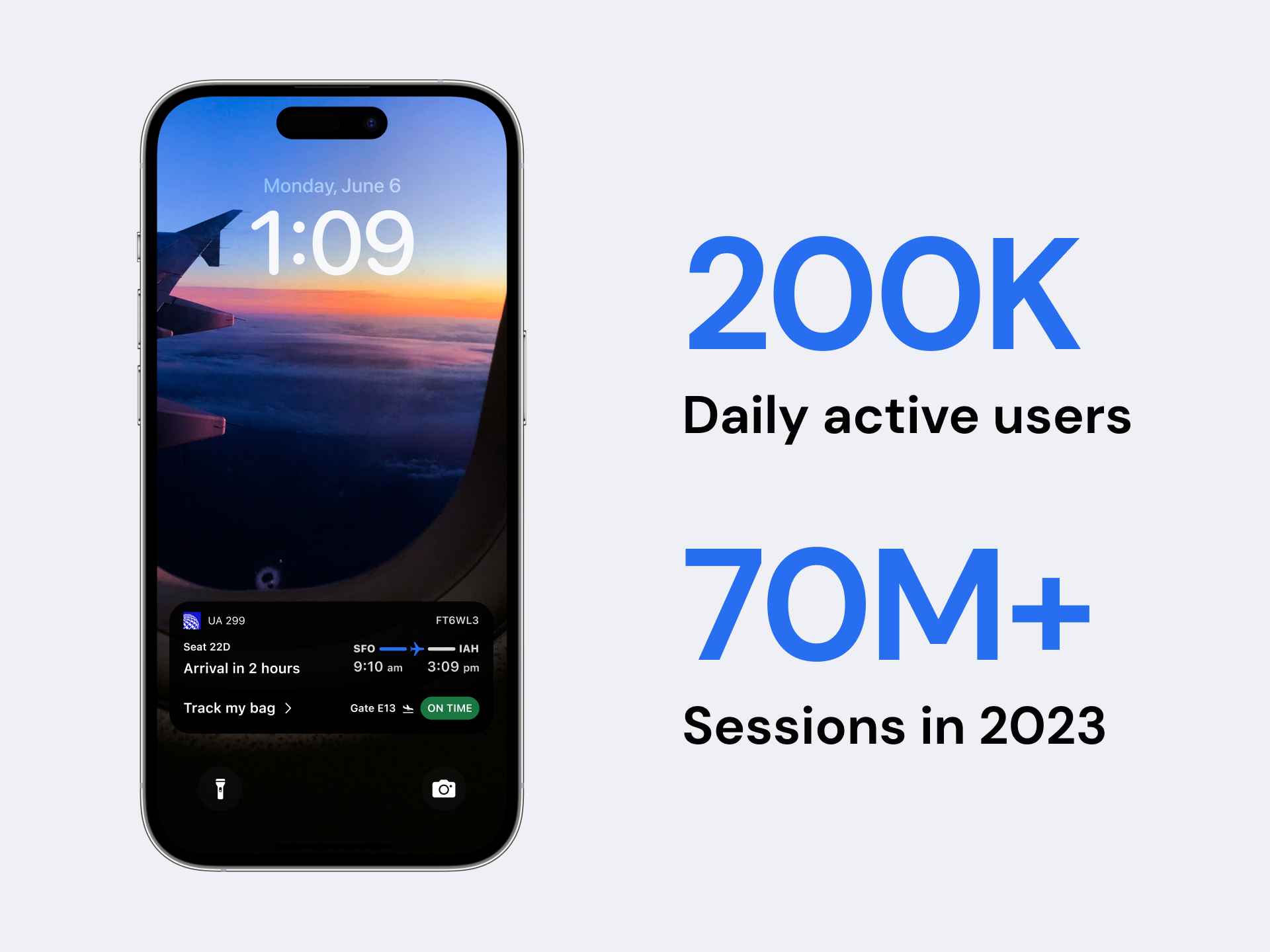
As of the end of 2023, United Airlines Live Activities had 200,000 daily active users. This equates to over 70 million total sessions throughout the year, a number which continues to reflect the demand for contextualized information, given to customers at exactly the right time.
Press
https://thepointsguy.com/news/united-airlines-app-live-flight-status
https://www.macrumors.com/2023/05/25/united-airlines-live-activities
https://simpleflying.com/united-airlines-rolls-out-live-activities-features-iphones
https://www.thestreet.com/travel/united-airlines-makes-revolutionary-tech-change
https://travelnoire.com/united-is-first-u-s-airline-to-offer-live-activities-for-iphone